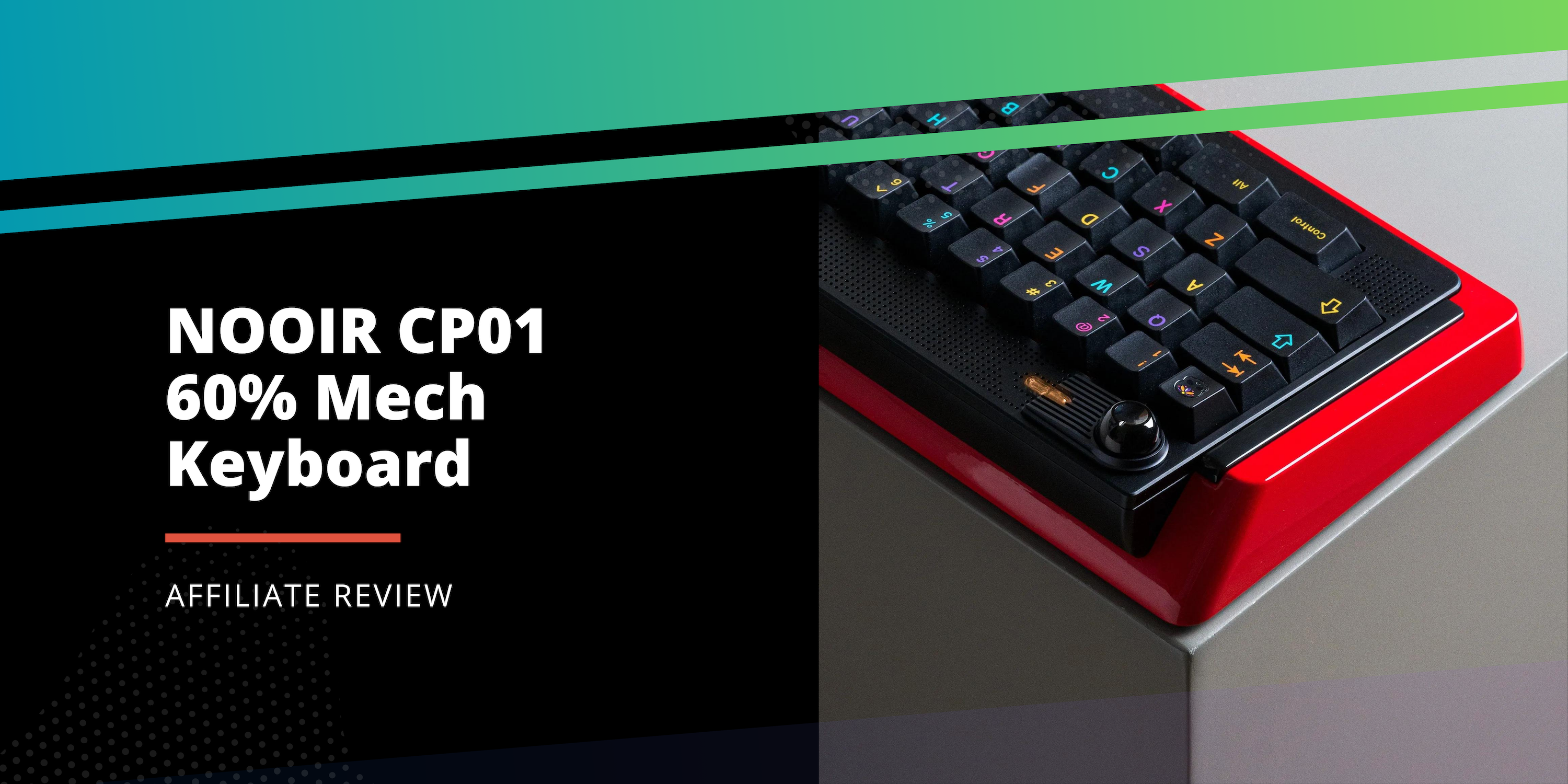
Alexotos Reviews the NOOIR CP01 60% Mech Keyboard
Note: This video review and written review were first posted on YouTube and alexotos.com and are re-posted here with permission from the author.
The Control Panel 01 (CP-01) Review
NOOIR has been making some really fun things in the keyboard scene lately, dropping some seriously unique designs. My first intro to them was with the Noland N1—a wild board with its own suspension system. It’s the kind of keyboard that feels more like a statement piece than something you’d use every day, but that’s exactly what drew me in. It was bold, impractical, and I loved every bit of it.
Now, enter the Control Panel 01. Priced at $499 USD (or $792 CAD before shipping and taxes), this one’s on the pricier side. It’s a 60% layout with a creative approach to mounting the PCB and plate, making it much more functional than the Noland N1. There’s a lot of fun to unpack with this board, but here’s the quick version if you want to save some time: while it’s a beautiful piece of design, it’s not the most versatile option for the price. If the aesthetics have already caught your eye, though, stick around—I’ve got a lot more to share about this one as it’s got some fun secrets under the hood!
Full Disclosure and Affiliations
Also, big shout out to APOS Audio for letting me take a look at this thing, they also sponsored the Twitch stream which helps me continue to produce high quality content. For clarity and transparency, all of this content will remain objective and unaltered. My thoughts are my own. I very much value being transparent with my content and relationship with vendors.

The Control Panel 01 (CP-01) with GMK Mictlan

So, What Is This Thing?
First off, the Control Panel 01 is a 60% board with a very fixed layout (for now). So what does that mean? Well, depending on the top frame you choose, you’re locked into a certain key layout—split spacebars, split backspace, and a split right shift. The idea here is that the board centers around a function (FN) key, easily within reach, letting you swap layers and squeeze more functionality out of the compact form factor. And hey, it’s fully customizable with VIA, which is always a win.
Personally, I would’ve loved the option for a full-size spacebar, and this locked layout kinda clashes with what I value most in custom keyboards: flexibility and customization. The limited layout might turn some people off. That said, it doesn’t make the board unusable—it just bumps up against the whole “custom” part of custom keyboards for me.
Now, let’s talk about the knob. It’s left-aligned, and honestly, I love this little detail. I’m not even usually into knobs on my boards, but the placement here makes a lot of sense. You can adjust the volume without even moving your hand off the mouse when doing tasks. It’s one of those quality-of-life features that seems minor until you actually start using it. Plus, the knob is stepped and presses down to mute, so it’s functional as well as stylish.
Enough About The Layout, Let’s Talk Looks
This board is a stunner, no question about it. The Control Panel 01 really breaks away from the usual rectangular design we’re all used to. It’s got a beautiful shape, an eye-catching side profile, and subtle accents that make it visually interesting from almost every angle without feeling cluttered. It even has a fun LED light that suits the boards style and acts as a wireless indicatior. But what truly makes this unit stand out for me is the finish. The red on mine? It’s a baked lacquer, and it gives the board a shine and depth I’ve never seen before. Paired with some anodized parts, this thing just pops!
Now, I didn’t know much about lacquer finishes before taking a look at this unit, so I did a little research to see how it stacks up against the usual anodized coatings we’re all familiar with. Here’s what I found:
- Anodization is more durable and resistant to environmental wear.
- Lacquer, on the other hand, offers a stunning aesthetic but is less durable and may need more upkeep, making it better for decorative or low-impact items.
Since this keyboard isn’t exactly getting tossed around, I’m not worried about it chipping or wearing down. But yeah, in this case, beauty does come with a bit of a trade-off.
Now, while the red lacquer on the exterior is flawless, the inside is a different story. We had a lively debate on stream about this—some people just didn’t care since it’s internal, while others felt that at this price point, they expected every inch to be pristine. It’s an interesting conversation, and I want to bring in some context.
First, let’s talk MOQ (Minimum Order Quantity). For those unfamiliar, MOQ refers to the smallest quantity a manufacturer is willing to produce while keeping it profitable. Typically, manufacturers offer better pricing based on larger order volumes. This is because you are promising them more work and overall revenue, and they can pass on a discount at those higher levels. To understand this for keyboards, most higher end boards these days are much lower than some of the big international releases. We are talking between 30 – 300 on the high end, which bigger brands can reach 5,000-10,000 + units.
With all this in mind, it’s easy to see why sacrifices are made on low MOQ items like the Control Panel 01 to keep costs in check. If not the prices can rack up and it would just be a failed project. Corners are typically cut in areas that don’t affect the final user experience or that no one will see, and sometimes corners aren’t cut and you can see that reflected in a final project. This is just one piece of the puzzle, though. There’s also the machining complexity and the sheer number of parts that need finishing. This board has a lot going on design-wise, which naturally drives the price up because it’s eating up more CNC machine time per unit. It’s the reason you see cheaper boards opting for flat pieces and more straightforward designs—less complexity means lower costs.
To be clear, I’m not saying this board needs to have its internals lacquered, but I get why some people would want that attention to detail, especially for a board at this price. Personally, it doesn’t bother me, but I think this is one of those subjective calls. My job is to give you the facts, so hopefully, this helps you make a more informed decision.


What About The Insides?
This is where the Control Panel 01 really shines for me. It has an incredibly unique mounting system that, for some reason, isn’t advertised well—and I honestly can’t understand why. They call these “sockets,” but they seem more like shock absorbers. When I first opened it up, I was worried it would feel cheaply made or produce some weird noise. But boy, was I wrong. Not only are they virtually silent during use, but they feel fantastic. I especially loved that the designers made it customizable, allowing you to pick and choose where to place them. It’s a very cool mounting system, and I’d love to see this design team use it more often.
Assembly was actually fun and pretty easy! Despite having some ribbon cables, which I normally find too delicate, I had no issues putting it together and really enjoyed the process of figuring out how I wanted to configure the mounting options. It even has some press in feet that hide the screws, which I always like.
The daughterboard is proprietary however, and I hope in the future they release the files for the plates, PCBs, and daughterboard. Side rant: it’s a great practice for companies to do this, especially if they have no plans to run a board again. That said, I also recommend designers use universal parts where possible. I understand the choice here, though, since the board has a wireless mode, a 4000mAh battery, and some lighting on the top near the knob.
This next point isn’t about the internals, but the front height of the board is 22mm, including the footpads. Personally, I prefer something in the 16.5mm – 20mm range, so this was a bit outside my comfort zone. I wish they had explored adding a cherry lip to the front to bring the height down a bit. This is a personal preference, but from the commissions I’ve done, I’ve noticed most people prefer the 18mm-20mm range. Just something to keep in mind when considering this board.


Sound And Feel?
I decided to leave the bottom foam in, and the keyboard has a very neutral sound that leans towards a fuller, deeper tone. It’s not overly bright, nor is it too deep or foamy. I paired the board with Cherry Nixies, but I also tried HMX switches and Diamond switches, and I really enjoyed the feel with long-pole switches as well. Where this board truly stands out is in the feel. After my stream, I experimented with the mounting system and noticed some pretty significant differences depending on what I used. I love how customizable it is, and I opted for a slightly softer mounting style. It doesn’t flex; instead, it has a very balanced bounce across the entire PCB assembly, which I prefer. It reminds me of the Salvation, just with more control.
Final Thoughts
Overall, I really like this board. The big question is, does it justify the steep price of $499 USD? The answer is both yes and no. It’s a bit complicated because it really depends on whether the layout fits everything you’re looking for. With all its unique features, if you love the layout and want a premium product with all the bells and whistles, it’s a no-brainer. However, I wish the same attention to detail given to the mounting system was applied to the layout and plate options. If it had that, it would be nearly perfect.
In terms of competition, its closest rival would be the Salvation due to the similar mounting style and form factor, which comes in at $345 USD. But the Salvation offers customizability and the ability to use universal PCBs, though you’ll miss out on the typing feel customization, aesthetics, and wireless mode that the Control Panel offers.
Personally, I still think the Control Panel 01 justifies its price with what it brings to the table, but it’s definitely a niche pickup—and that’s okay! If this board speaks to you, you’re really going to enjoy it.


